
The responses to “What Does a Real Art Critic Think of Skate Art?” — both positive and negative — were overwhelming, so we’re hitting you with Round 4: Critic vs. Skart. Again, we asked Shana Nys Dambrot, an LA-based critic with a deep CV, to speak on iconic works from some of our favorite skateboarder’s artwork.
Given Shana’s background in creating and critiquing art in the “real” world, she’s a perfect fit to offer an unbiased perspective on skateboarders’ artwork. So when she looks at one of Chad Muska’s sculptures, her response isn’t swayed by a too fond memory of a Muska Flip.
Without sharing any background info on any of the artists with her, we sent Shana a fresh Dropbox link and got her honest opinion on works from a new batch of art made by famous skateboarders (this time, with audio too!) Full-on curation mode baby.


Dave Carnie – The Pig Flower
This. Is. Amazing. I’m obsessed. The medium of photocollage is one of those things that has a broad appeal to both audiences and artist, but is particularly susceptible to falling short of the vision. The zeitgeist of juxtaposition and naturally occurring surrealism that characterizes our visual culture’s relentless information onslaught, augmented by the ways our Insta feeds reorganize our neurons, make the appeal all the greater.
The truth is, collage was also a favorite of the early surrealists and the Dadaists, who were attracted to the absurdity, sophistication, and intuitive cultural and experiential insights the technique offers. This work benefits from fine-tuned, patient perfectionism in craft, which is more necessary than usual for such a composition to work. Nuances of scale, angle, pictorial space, and the re-use of an image as another kind of object within a picture (such as bracelets for atomic halos, architecture for anatomy and etc.)…all this has to be seamless and plausible, which is harder to accomplish when you’re using found source material than pure invention for your imagery.
The specific story of this picture is full of whimsy and humor, smartly conceived with a solid gestalt, a lot of charm, and just the right amount of eeriness. I love it.


Ed Templeton – Contagion
This is a very well executed work, deceptively simple as it seems reductive at first but soon with contemplation reveals its depths and complexities. The four figures at first glance seem schematic and overly similar, when in fact each possesses subtleties of individual face, body, and attitude. I love the moments of discovery, especially regarding the interaction between the figures, such as the transference of spots between the two lightly touching middle figures, and the way the “spirit” of the blue figure has been rendered as a forward-moving energy field by the innovative directional drips of the pigment.
The same intriguing use of the natural bleed of the pigment to create the skin spots on the main figure is also quite wonderful. By creating/generating the pattern rather than drawing or rendering it, it has a deeper sense of being organic or natural, within the otherwise illustrative style.
The detail of it being a diptych, with the seam happening at the moment of the one figure’s outreaching arm has a poignant material wit. This may well have been a happy accident born of paper size restrictions, but the way it’s handled adds value to the composition. Eccentric palette, stylized figures, there is a real individual style making itself felt here. It’s lovely.

Harif Guzman – New York Crimes
This one I’m not so sure about. It’s messy but not in a salient way. What I mean is, it doesn’t seem like the mess is controlled or deliberate or self-possessed. It’s just mess for its own sake.
With semi-nude models likely from some sort of commercial advertising, the anomalous cheetah, the silliness, the inclusion of the New York Times logo makes me think there’s a level of social critique at work. Like, instead of news we consume this nonsense, and I’m so angry I threw all my paint at it.
The trouble is, it’s not only messy looking, it’s muddled feeling. The ambiguity of the work’s message works against its own interests because it’s not sophisticated enough to make an argument, but it’s not feral, wild, or authentic enough to be visceral. It’s just sort of like a tantrum without a cause.

Hiroki Muraoka – Black Rain
I like how this artist uses collage more like paint-strokes or maybe even more like the tiles of a mosaic, with bits and pieces building a whole rather than single images brought into new concert. In contrast to the cleaned-up European style surrealism of the first image (also a terrific collage work), this seems to be channeling more Eastern, folkloric or even tribal aesthetics.
By using elements of color and text not as versions of themselves but as pieces of color and pattern (even the pictographic writing takes on an element of pure image texture for those who can’t read the language), the artist calls attention to their own process of building an image. The balanced asymmetry of the face and features plus the stylized waves of the mysterious setting give it a sort of ritualistic flair, like it’s a portrait of a spirit or godlike being rather than an ordinary human likeness.
I love the contrast too between the density of detail in the face and upper half of the picture in contrast to the “empty” space of the lower half, which is still full of texture in its surface, and resolves into white-capped ocean waves — adding to the mythological presence of the figure above.

Nora Vasconcellos – Untitled
I am really feeling the way this artist presents a stark contrast between a flatly expressive abstract background and the highly resolved and extremely well-drawn figure—more so because the figure is specifically a sort of buttoned-up businessman type who does not belong in its dreamy blustery tertiary-palette atmosphere. The economy of scale is interesting too, with the finely detailed part being relatively small within the expanse. However, I’m not as sure about the other pictorial elements—the leaves and the castle.
I sort of get they were meant to bounce the eye around the space, maybe create some mood and depth to the picture plane, but because they are not rendered with the same brilliant attention as the figure, it doesn’t work. I think those elements should be left out, or else depicted with the same level of skill as the figure. As it is, they seem cartoonish which is distracting.
The piece would benefit from its foundational contrast of two styles, those elements feel like the intrusions of a third. I’d rather see them gone or more fully drawn, right now I think they take away from the clarity of the point of view and story of the rest of the composition.

Yoon Hyup – Rainy day, Mirrorball Downtown
This is interesting. I appreciate the way the artist is nodding both to a sort of hyper-hyper-stylized version of Impressionism or more so, Pointillism even though it’s oblongs not dots. It’s interesting that they are able to be so evocative and descriptive about the architecture and the atmospherics of the street scene — the light bouncing, the reflections of artificial, colored light onto wet paving stones, the forced perspective of the alley. It’s oddly naturalistic in its attention to phenomenological observation, given the tendencies toward abstraction in the visual language.
Using so many variations of black, and also surface/texture shifts, along with the high-contrast elements of bright almost primary colors, gives it a contemporary feel with a hint of retro and yet also post-digital aesthetics. But it also functions very well as a legible depiction of a particular place.
It’s a little eccentric and very well-controlled. I’d be curious to see this technique applied to more subjects — other urban scenes, natural landscapes, portraits…just to understand more about how this style can be transferred to a vision of the whole world of images.
The Shop


Related Posts
-
 WHAT DOES A REAL ART CRITIC THINK OF SKATE ART? (ROUND 2)
Hear what a fancy art critic thinks of art made by famous skateboarders.
-
WHAT DOES A REAL ART CRITIC THINK OF SKATE ART? (ROUND 3)
We brought Shana the art critic back for the third round of skart criticism.
Comments
Popular
-
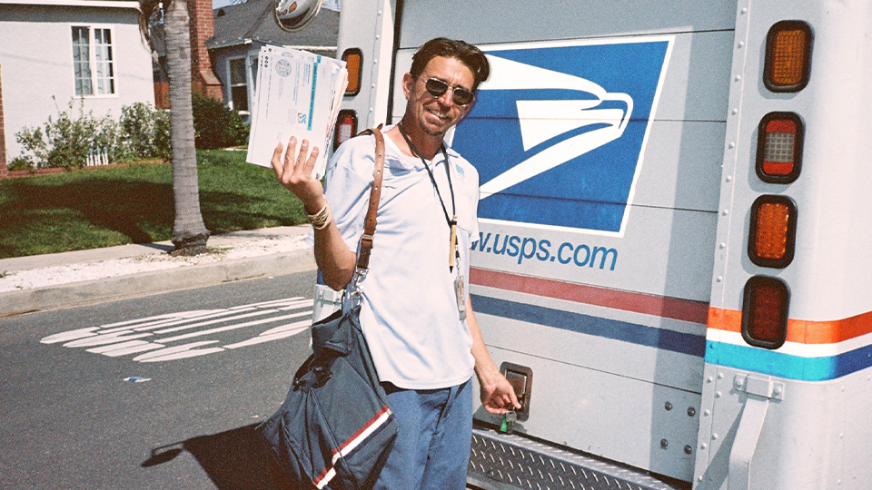 FROM PRO SKATER TO POSTAL WORKER: LIFE AFTER SKATEBOARDING
We met up with Joey Brezinski to see how the second chapter of his career is coming along.
-
 HANGING OUT WITH ANDREW HUBERMAN, SKATEBOARDER TURNED NEUROSCIENTIST
Curious what it would be like to hang with this guy outside of a stuffy podcast studio? Us too.
-
 KEITH HUFNAGEL ON THE FUTURE OF HUF
We heard a rumor that HUF was going out of business, so we talked with boss man himself to find out.
-
 PRESERVING SKATEBOARDING’S OUTSIDER ERA
Crusty ramps scrawled with punk rock graffiti, derelict characters, awkward 80's portraits, and more from The Past Participle.
-
 WHAT EXACTLY HAPPENED TO SKATELINE? AN INTERVIEW WITH GARY ROGERS
Skateboarding's high-energy news anchor opens up about fame, hate, and what it was like hosting a show for 12 years.
June 19, 2018 3:47 pm
Carnie’s work is amazing, not surprised she loved it.
June 19, 2018 4:45 pm
This is good I enjoy
June 19, 2018 8:13 pm
Fun read, Ed Templeton is a MFG!
June 20, 2018 10:12 am
These are awesome
Send her a spanky pice