
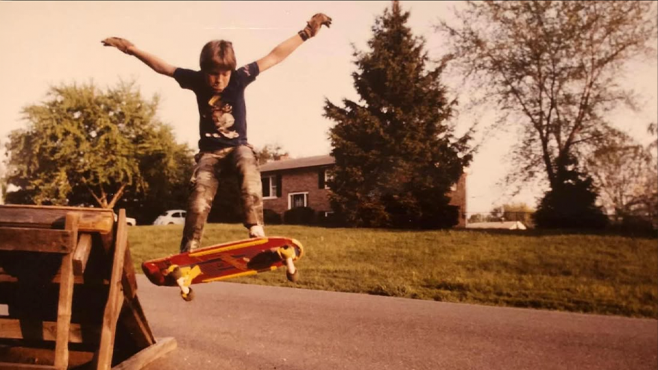
It’s easy to forget that just a few decades ago, the art produced by skateboarders wasn’t taken seriously by the art world at large. In 2017, “skart” is somewhat of a trope, so much so that the fading-pro-cum-artist is very much a cliché. Skate art is even in high profile art fairs such as Art Basel, Frieze and sought after by higher profile collectors, including our current President (puke).
In order to get a little perspective, I put out some feelers looking for an art critic that would look at some established artists born in the skate world. We asked that they review the works without knowing who created it; just five .jpegs and their informed opinion.
After a few referrals, I landed on Shana Nys Dambrot, an LA-based critic, with a deep CV and even deeper credits as a critic. As a former Art History major at Vassar, art writer, curator, and an artist herself, Shana was more than qualified, so I hit her up, sent her a Dropbox link, and got her honest opinion on some notable works from us skateboarders. With no further background info, we asked Shana for her take:


Arto Saari – (no title)
This is a classic American kind of image, so classic it risks cliché. And yet the impulse to capture this moment is undeniable and universal. Anyone who found themselves on a remote, rain-splashed highway, with these verdant surroundings and a snow-capped peak, just so, at the end of a perfect straight blacktop… well, no one could resist grabbing a camera. The landscape on its own is a thing of beauty. The addition of the trio of bikers not only adds a narrative element to the scene but sets an almost cinematic, Easy Rider tone of edge and freedom.
In a way, the shot is more about their experience than the photographers because of their small size in the expansive frame of the view. The assertive linearity of the perspective draws the eye forcefully to the riders and through them to the horizon ahead of them/you/us, which reinforces the overall sense of forward motion in both the picture and its story context. While the composition is spot-on, the production quality of the image (crispness, sharpness, distribution of light, saturation of color, heightening of contrast) reads more as a great amateur snapshot than a professional photographer. In other words, the bones of the image, the instinct for framing and the decisive moment are solid, but the vision could benefit or rather be clarified/amplified by more advancement in technique; better processing would increase both its pleasurability and gravitas. It doesn’t have to scream, but right now it whispers.

Ed Templeton – Eulogy for Lost Saliva 2
A young couple kissing on a beach is perhaps one of the most timeless images in film and photography history. The sweet urgency of youth, the beauty of both people, their sexy but natural and fairly modest postures — overall this image embodies the very ideas of love, curiosity, and summer itself. There is humor in it too, in the jaunty angle of the boy’s captain’s hat and how he holds his sunglasses off the hot sand even though the girl has his full attention. And there is a bit of wit, too, in the other obviously modern-day details like the shades and the print of his jams, contrasting with the soul of the beach blanket movies of the 60’s which it channels generally.
Then again, the setting is also a bit off; not necessarily in bad way. Like the print of the shorts, the strangeness of the plain cement wall backdrop, when presumably there’s a whole beach scene in the other direction, pops the image back to the present day. The location is not beautiful; perhaps it is a secret place in which we are the intruder. This whiff of shadiness enters the otherwise light-hearted image and makes it deeper, stranger, more modern and mysterious. The longer you look, the more it goes from sweet to salty, ultimately offering the viewer more than first meets the eye.

Stefan Janoski – (no title)
What this bronze sculpture lacks in technical refinement actually works for it on an emotional level. The symbolism of something like a sad king, in a child’s pose with a time- and worry-weathered face, with a fanciful crown and tattered cigarette, whose spilling cup gives rise to a river and a tree — it has a dark fairytale psychological effect, and this is what is heightened by the roughness of the anatomy and the surface of the metal. There is a journey from death to life as the eye moves from the figure to the tree, and the deep textures, shadowy contours, and dark patina of the bronze reinforce the allegorical quality of the work.
The wide spread of the figure’s feet has a tribal, pre-Columbian artifact sensibility. But where that could potentially make for an engaging dissonance with the modernity of the rest of the figure, in fact, in this case, it is unbalanced aesthetically—that primitivist instinct might do well carried throughout the rest of the work, or else have that lower half of the sculpture read as more modern-day. Having those stylistic differences distracts from the overall flow of the whole because it’s a bit split personality. In general though, a lot of skill in a difficult medium that makes the viewer eager to learn more about this work, and to see more from this artist.

Chad Muska – Mirror Image
The positive/negative contrasting qualities of this diptych are much more old-school in terms of abstraction and a conceptual approach to materials than one expects in today’s hyper-technicolor super flat and saturated visual culture. It has a certain art historical confidence to it, in the way it addresses gesture and abstraction, that brings to mind the mid-century American painters who really explored the architectural potential of non-figurative painting. The hand of the artist is implied in the deconstructed brushwork, as one thinks of masonry tools as opposed to studio in interpreting the manipulation of paint. It channels both sculpture and photography in the way it creates texture and almost-repetition, imprint and echo.
The ghosting effect is almost like underpaintings steaming up from beneath the new surfaces. The gray-scale palette highlights those qualities so that the attention is brought to bear on the line and the texture, creating optical movement like a zoom, in and out, back and forth between detail and the whole, and especially between the two halves, on the hunt for detail and difference. This creates a longer duration and more focused quality of attention, almost akin to reading, and much more drama than a simple black and white abstract composition might suggest. The concern would be keeping it fresh while translating this idiom into other shapes, patterns, or through the introduction of color.

Mark Gonzalez – The park
For a full-length portrait of a blue-skinned demon wearing nothing but thigh-high fishnets and a giant boner, this is actually a very delightful, complex, smart, and charming painting. The way the text is included but obscured, combined with the division of the image into several almost-separate color-block parcels combine to give the overall work a feeling of being a journal page—and therefore private, personal, and full of unknown significance. The looseness of the rendering gives it a vibrating energy of quick gesture.
The way the ground is built seems like grass and sand or concrete—echoed by the word “park” and the curling vine around the figure’s arm. Strange quasi-industrial architecture reinforces the setting as being outside, which makes the assertive nudity both funnier and zanier. The palette is just natural enough to read as familiar space, but at the same time, it has a tertiary awkwardness that speaks to a more refined fine art sensibility.
Also, the raw refinement and, relatively speaking, the restraint of embellishment has a certain self-possessed maturity in style, which makes the giant blue hard-on at the picture’s exact center a little bit more like dark humor than the visual assault it might otherwise be. In fact, the penis, while not a dealbreaker, distracts a bit from the best aspects of the technique, which risk being lost in a fog of low-level shock value. That said, the kinky boots, rendered with such elaborate patterning patience, work so well in part because of the nudity. So not a deep problem in this picture, but something to keep an eye on generally in terms of balance.
The Shop


Related Posts
-
 REMEMBERING THE MALL RAT SHOE: THE ETNIES CALLICUT
A look at the shoe that flooded malls, skateparks, teenage girls' ankles everywhere.
-
 EVERYTHING YOU NEVER KNEW YOU WANTED TO KNOW ABOUT GRIPTAPE
Strictly for the skate nerds!
-
 DIVING INTO VANS “CREDITS” AND THE VIDEOS THAT PAVED THE WAY
The recent push is a sign that brands are beginning to understand how to foster actual growth and energize the community.
-
 MY EXPERIENCES IN SKATEBOARDING
"I've been terrified of garnering the reputation of 'ramp-tramp' or 'pro-ho' just from spending time with skaters."
-
 DECODING SKATEBOARDING’S MOST POPULAR PHRASES
Wanna work in skating? Just sprinkle these 7 phrases around and you'll sound like a "skate linguist" in no time!
-
 WHAT DOES A REAL ART CRITIC THINK OF SKATE ART? (ROUND 4)
We asked a LA-based critic to speak on some of our favorite skateboarder's artwork.
-
 HOW WORRIED SHOULD SKATERS BE ABOUT CTE?
What happens when skaters repeatedly smack their heads on concrete over the years?
-
 MY 30-YEAR QUEST OF LEARNING BACKSIDE TAILSLIDES
"I still want to be a back tail guy. I still want to be cool, however pathetic that sounds."
Comments
Popular
-
 HANGING OUT WITH ANDREW HUBERMAN, SKATEBOARDER TURNED NEUROSCIENTIST
Curious what it would be like to hang with this guy outside of a stuffy podcast studio? Us too.
-
 KEITH HUFNAGEL ON THE FUTURE OF HUF
We heard a rumor that HUF was going out of business, so we talked with boss man himself to find out.
-
 PRESERVING SKATEBOARDING’S OUTSIDER ERA
Crusty ramps scrawled with punk rock graffiti, derelict characters, awkward 80's portraits, and more from The Past Participle.
-
 JENKEM MIX 163: ALAN BELL
Out of 163 mixes, this is the first one (we think) with the setlist written with the non-dominant hand.
-
 DUMB PARTY PRANK IDEAS THAT YOU MAY FIND ENTERTAINING
Most of these will get you shunned or punched, but all will be sure to liven the night’s mood.
November 17, 2017 11:35 am
haroshi
November 17, 2017 12:24 pm
But!!! It’s Gonz!! Everything he does is perfect and amazing!! 🙄
November 17, 2017 12:30 pm
What? No Sean Cliver?
November 17, 2017 12:33 pm
Gonz art -> overrated crap