I remember looking at my brother’s CCS Mailorder catalog as a kid in the early 90s and feeling like I was doing something wrong. I loved the graphics, cool cartoons and artwork any youngster would like, but there was something “off” about many of them. Something more mischievous that my innocent mind couldn’t comprehend. That was the feeling that attracted me to skateboarding – I didn’t really “get” the culture or the graphics yet, but I knew I wanted in.
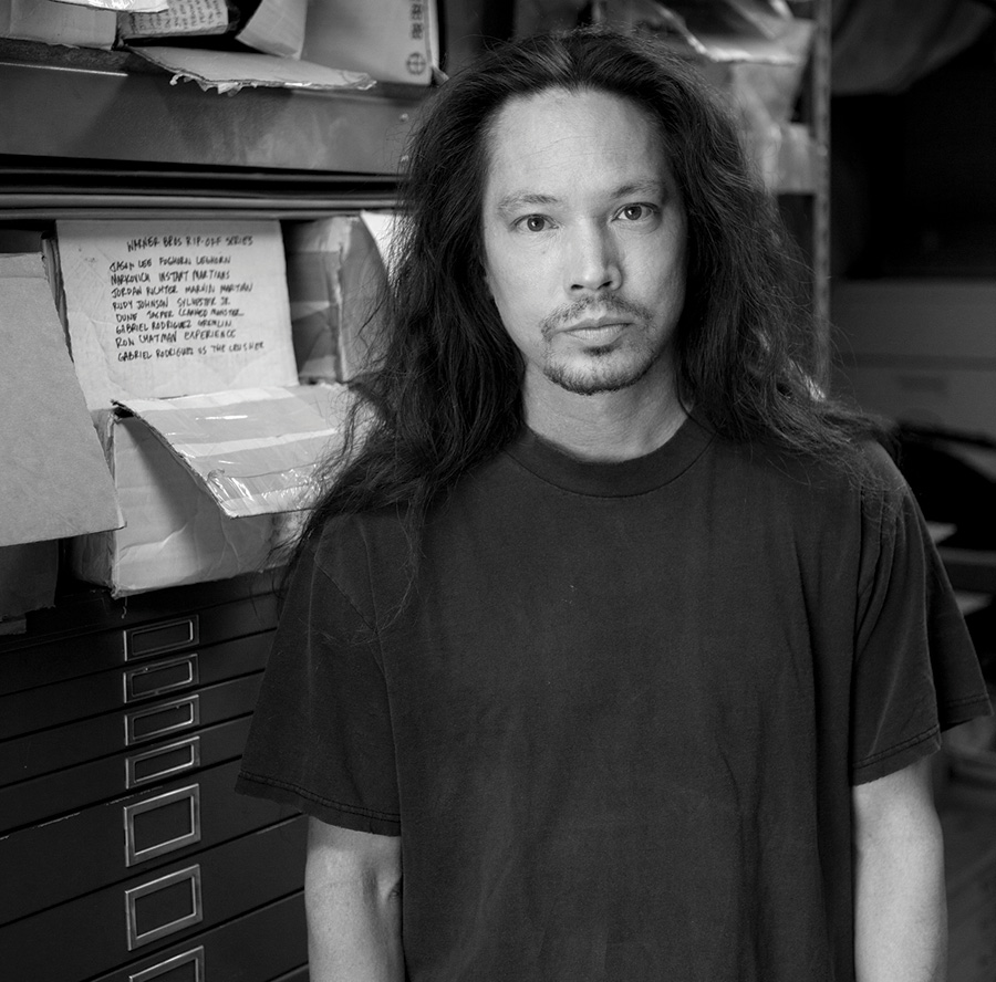
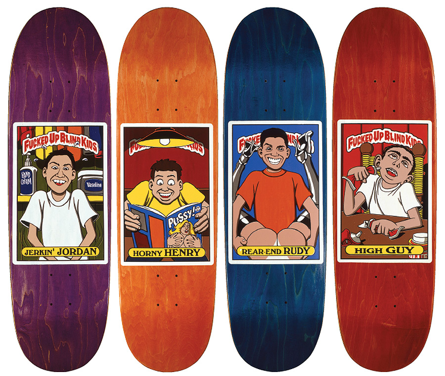
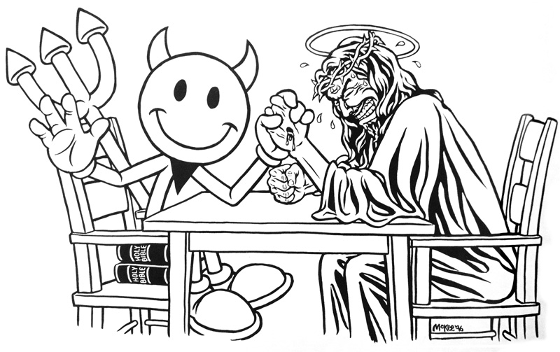
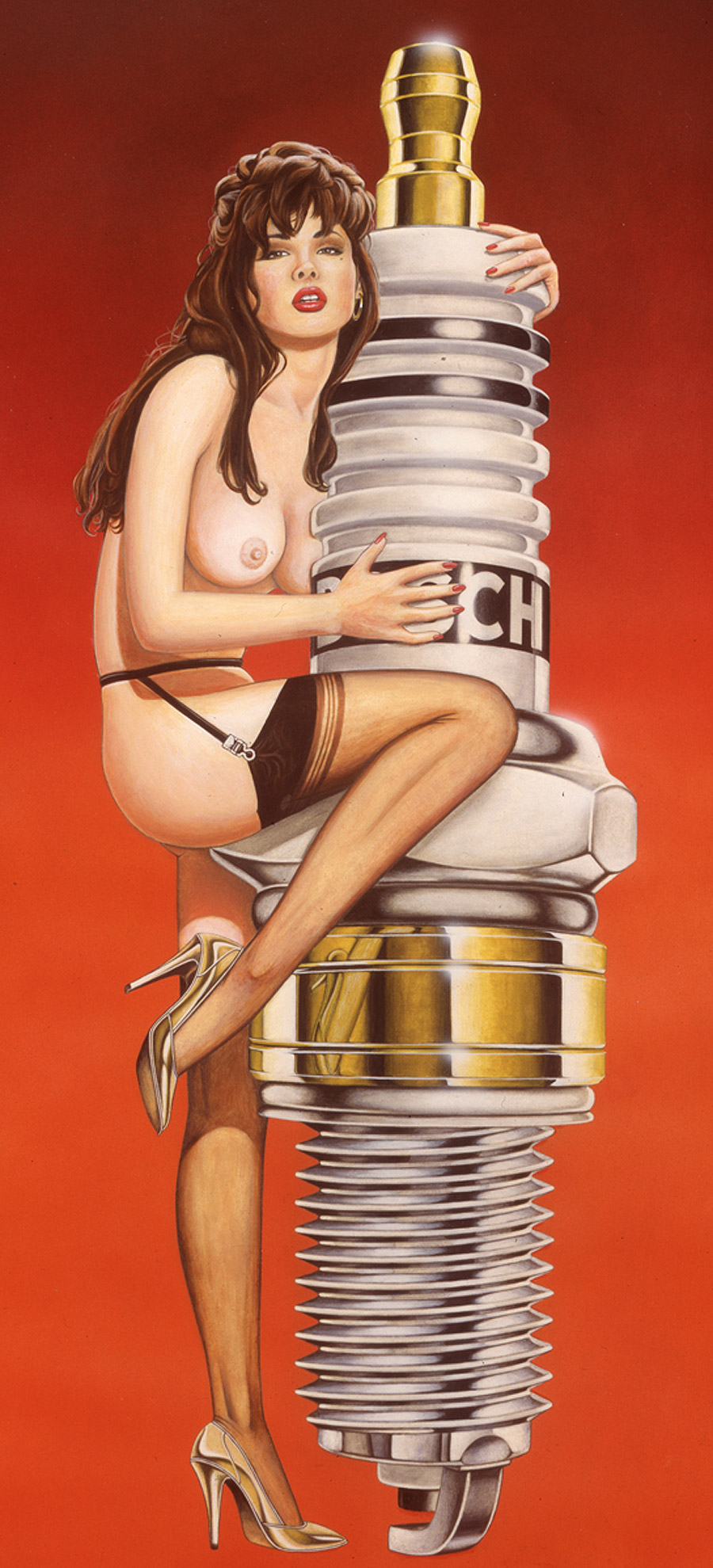
Marc Mckee is largely responsible for that feeling, and era of fucked up, sexy, fun and controversial board graphics. Marc, along with Sean Cliver designed some of the best graphics of the time, ripping off logos, making fun of riders and including sex, violence and “adult topics” which made skateboarding so exciting.
Still continuing his legacy all these years later and designing graphics for Blind and Cliché, I had a chance to talk to Marc about his twisted mind and ask him why skateboard graphics are so boring today.
How was your childhood growing up? Where do your twisted & perverse illustration ideas come from?
I grew up in Marin County in Northern California. High School was pretty much like a John Hughes movie. Sometimes the boredom of suburbia can cause you to react in a certain way…. I was pretty obsessed with the art on all the Iron Maiden covers. They were violent, but also funny. Like on the cover of Number of the Beast, in the flames at the bottom in very minute detail you can see two people having sex. Also the Devil’s face on there is Salvador Dali. I’m not sure if I knew who he was at the time, but he was definitely a later influence.
When you are drawing girls & nude graphics, does your imagination ever run wild and you turn yourself on so much you have to pause the session and beat off right then and there?
Yes, that happens all the time. Just kidding.
Why are skateboard graphics so boring now? Lots of generic designs and stuff that doesn’t have any soul or humor to it..
There’s still a lot of cool stuff, but maybe it’s just harder to find? Sieben had a piece about the prevalence of logo boards a little while back in Vice. I thought it was pretty much spot on with what he had to say.
Why were graphics back then approached more like individual pieces of art? Many skaters even did some of their own board graphics, but that rarely happens anymore…
I don’t know, but it’s probably just the result of skating becoming super popular. It would be impossible for there to be enough new individual works of art to go on every deck. Another explanation though could be that a lot of times tastes change for no reason, like in clothing or music. What the current generation likes has to be the opposite of what came before.
”What the current generation likes has to be the opposite of what came before”
Do you ever feel any moral responsibility, when drawing some of the more controversial graphics? Did you ever feel like you went “too far”?
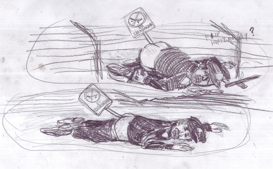
I don’t really think any of them went too far. I read recently in the FTC book though that Jovontae wasn’t really down with the Lench Mob board, which I guess I already knew. That was kind of a gnarly graphic to put out for someone without their approval [laughs]. Now if there’s something in the works like that for anyone I try to make sure that they know about it beforehand. There’s gonna be this board coming out for Cliché pretty soon as a follow up to the Randy Colvin graphic from the 90s that came in the black bag. At the rider’s request I took out one part of the new graphic where this girl was shooting heroin. I guess there’s some kind of big heroin epidemic going on right now? Anyway, I could kind of see his point in not wanting that in there. One day though I’d like to release the original shooting heroin version if possible. You know, tragedy + time = comedy…
Everyone seems to love to talk about the 90s World Industries era graphics and claims that era had the best art ever.
Do you ever get sick of it or think it is over-romanticized or overrated?
I wouldn’t say it’s overrated, but I know there’s a lot of people who’d say that the 80s were the real true defining era of board graphics. I kind of agree with that since it’s when I was growing up and those are the graphics that had the biggest impact on me. On the whole though there was a lot of shit from the 90s that is pretty awesome. I have this piece I want to do someday called “80s vs. 90s.” It would be like all the icons from both decades in like a Warriors-style gang fight. Like the Psycho Men vs. the Goofy Boys. Then real small in the foreground or off to the side would be a skater from the modern era with the thought bubble, “Who gives a shit?”
Do you think you could design another set of cartoon characters for World Industries and make it a #1 company again?
There might be something they could do, but I doubt that formula would work again. Is World even still a company? I heard they were out of business.
In the early years of Big Brother Magazine when you were the editor, was there any specific article you or Steve Rocco [the publisher] really wanted to do that never made it to print?
The only one I can think of was during the first couple issues when he wanted Earl Parker [writer] to go to Hollywood to interview some hookers for a piece called “Ho Spotlight.” That’s really the only one I can remember since after about issue 5, Steve Rocco pretty much gave up on the magazine. By then his main focus was on Duffs and Plan B, both of which were viable businesses, as opposed to the magazine, which was hemorrhaging cash. Anyway, the piece never got published since maybe Steve didn’t think the photos were hot enough. Or maybe it was because no actual interview was conducted? I can’t really remember. One of the photos eventually made it into issue 4 though in the psychological profile on Alternative Eric.
Do you keep in touch with Steve Rocco at all? What do you think he’s doing? When is the last time you saw him?
The last time I saw him was about two years ago at his girlfriend’s place in Venice. His daughter is around 8 or 9 years old by now so that probably takes up a lot of his time. Other than that I’m not sure what he’s been up to. He sold his house in Hawaii a while ago, and now he just lives in Malibu. A couple times I went up to his old place in the Cove to surf, but that must have been about ten years ago.
Chris Nieratko has said that VICE started as a wanna be Big Brother, a rip off, just without the skating. Would you agree?
There’s enough differences between the two to where Vice is more of its own thing. I don’t really know how they started. On Wikipedia it says it came from Canada and it was originally called the Voice of Montreal?
Does drawing under the influence help be more creative? Have you created any board graphics we might know fucked up?
It helps you think you’re being more creative—haha. No, actually I can’t work under the influence of anything except caffeine. I used to smoke weed, but I had to stop doing that a long time ago after it started making me way too paranoid. For a while though, we had an office bong at World Industries. That got used a lot. Eventually it got moved into the dark room. I’m not sure if that was a good combination—THC mixed with photography chemical fumes. I would try to work stoned, but it never went that well. Back when I was drawing this graphic for Hartsel, the Wisdom Tree. I went over to his apartment in Venice to work on it. There were a bunch of people over there so we were smoking. I couldn’t get anything done. And then to make matters worse, he came over to check out the graphic. I was trying to draw this knothole in the trunk of the tree, and he took one look at it and was like, “Dude, that looks like a fucking twat!” I had to cover it with whiteout and totally redraw that part.
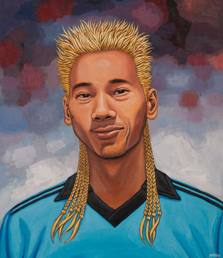
You drink alcohol, right? Do you ever get the “asian flush”?
Yeah, that happens to me pretty bad, which really sucks. I recently tried the Milk of Magnesia cure, which is rumored to prevent the redness, but it pretty much only worked as a laxative.
Did you ever think about taking an allergy pill before drinking? Have you tried any other remedies?
I’ve tried a lot of things and nothing’s really worked. Luckily cheap beer seems to have the mildest reaction compared to wine or hard liquor.
What’s your daily schedule? How does it differ from your 90s schedule when you were doing graphics for World Industries?
I’m trying to go back to the way of doing things from back then. The main difference is going back to spending as much time as needed on each graphic and trying not to rush anything. As far as drinks I mainly just drink a lot of hot tea. Or if I’m starting to crash then I’ll switch to black coffee. For music I mainly just listen to the same heavy metal albums over and over again. Although when I was working on the Cliché World Cup Series I had the soundtrack for The Lord of the Rings on repeat. Those were the first board graphics I had painted by hand in almost 20 years, so I was really trying to stay focused.
What albums?
The first Black Sabbath album and The Sword, Age of Winters.
Looking back are there any graphics you are embarrassed about?
There was this one for Gideon Choi that was based on a Yakuza/Japanese Mafia theme. Gideon is Korean, so that didn’t fucking make any sense. Another one, coincidentally also on an Asian theme, was this one for Enrique Lorenzo that had this girl with a Siamese cat on her lap. I found out later that Hook-ups had a similar graphic and it was just done way better. Over time I tend to obsess over things. Last year I even borrowed back a painting that I had given to a friend back in the 90s since I wanted to repaint part of it. Hopefully I’ll get around to that later this summer.
Related Posts
Comments
Popular
-
 A CHAT WITH LUDVIG HAKANSSON, THE OLDEST SOUL IN SKATEBOARDING
The man loves to read Nietzche, skates in some expensive vintage gear, and paints in his own neoclassical-meets-abstract-expressionist style.
-
 LOUIE BARLETTA ON LEAVING ENJOI AND WHAT THE FUTURE HOLDS
"When I quit last week, my thought was that I was gonna just chill and not do anything."
-
 THE RISE AND FALL OF FUEL TV
Walk through the history of Fuel TV, the first dedicated TV channel for skateboarding and action sports.
-
 SKATERS RECOMMEND THEIR FAVORITE SKATE PANTS
We hit up some pro skaters and Jenkem contributors known for their 'fits to offer recommendations.
-
 A POST-OLYMPIC CHAT WITH CROWD FAVORITE POE PINSON
"I don’t identify with only contest skating, core skating, or anything. Those are just labels that people come up with.”

May 29, 2014 3:16 pm
Great interview, love hearing Marc’s perspective on things. Excited for the new Colvin follow up graphic!
May 29, 2014 3:53 pm
Killing it
May 29, 2014 4:37 pm
Best dude.
May 29, 2014 4:57 pm
Nice. I’m listening to Age of Winters at this very moment. Trippy, maaaaaaan.